Homework #4 – Getting Started Guide

1 Unsupervised Clustering Algorithms

1.1 K-Means Clustering

1.1.1 Cluster Assignment Visualization

When visualizing clustering results, using distinct colors helps identify group boundaries:

Code
# Example of visualizing clusters with appropriate colors
np.random.seed(42)
x = np.random.randn(100, 2)  # Random 2D points
labels = np.random.randint(0, 3, 100)  # Random cluster assignments

plt.figure(figsize=(6, 5))
colors = ['blue', 'red', 'green']
for i, color in enumerate(colors):
    plt.scatter(x[labels == i, 0], x[labels == i, 1], color=color, label=f'Cluster {i}')
plt.legend()
plt.grid(True)
plt.title("Cluster Visualization Example")
plt.xlabel("Feature 1")
plt.ylabel("Feature 2")
plt.show()

Visualization of cluster assignments with color coding

1.1.2 Confusion Matrix Interpretation

Confusion matrices help evaluate clustering quality but require careful interpretation since cluster indices may not match true class labels:

Code
# Example of creating and interpreting a confusion matrix
true_labels = np.array(['A', 'A', 'B', 'B', 'C', 'C', 'A', 'B', 'C'])
pred_labels = np.array([0, 0, 1, 1, 2, 2, 0, 2, 1])  # Arbitrary cluster indices

# Count occurrences
confusion = pd.DataFrame(
    {0: [3, 0, 0], 1: [0, 2, 1], 2: [0, 1, 2]},
    index=['A', 'B', 'C']
)
print("Confusion Matrix (rows: true labels, columns: predicted clusters):")
print(confusion)
Confusion Matrix (rows: true labels, columns: predicted clusters):
   0  1  2
A  3  0  0
B  0  2  1
C  0  1  2

1.2 Gaussian Mixture Models and EM

1.2.1 Understanding the Multivariate Gaussian

The multivariate Gaussian probability density function forms the foundation of GMM:

Code
# Visualize 2D Gaussian distributions
def plot_gaussian(mean, cov, color='blue', ax=None):
    if ax is None:
        fig, ax = plt.subplots(figsize=(6, 6))
    
    # Generate grid of points
    x, y = np.meshgrid(np.linspace(-5, 5, 100), np.linspace(-5, 5, 100))
    pos = np.dstack((x, y))
    
    # Calculate multivariate normal PDF
    det = np.linalg.det(cov)
    norm_const = 1.0 / (2.0 * np.pi * np.sqrt(det))
    inv_cov = np.linalg.inv(cov)
    
    result = np.zeros_like(x)
    for i in range(x.shape[0]):
        for j in range(x.shape[1]):
            x_centered = pos[i, j, :] - mean
            result[i, j] = norm_const * np.exp(-0.5 * x_centered.T @ inv_cov @ x_centered)
    
    # Plot contours
    levels = np.linspace(0, result.max(), 5)
    ax.contour(x, y, result, levels=levels, colors=color)
    
    # Plot eigenvalue directions
    eigenvalues, eigenvectors = np.linalg.eigh(cov)
    for i in range(len(eigenvalues)):
        length = np.sqrt(eigenvalues[i]) * 2
        ax.arrow(mean[0], mean[1], 
                eigenvectors[0, i] * length, eigenvectors[1, i] * length,
                head_width=0.1, color=color)
    
    return ax

# Example usage
mean1 = np.array([0, 0])
cov1 = np.array([[1, 0.5], [0.5, 1]])

mean2 = np.array([2, 1])
cov2 = np.array([[0.8, -0.3], [-0.3, 0.5]])

fig, ax = plt.subplots(figsize=(7, 6))
plot_gaussian(mean1, cov1, 'blue', ax)
plot_gaussian(mean2, cov2, 'red', ax)
ax.grid(True)
ax.set_xlim(-5, 5)
ax.set_ylim(-5, 5)
ax.set_xlabel("X")
ax.set_ylabel("Y")
ax.set_title("Multivariate Gaussian Distributions")
plt.show()

Contour plots of two 2D Gaussian distributions with principal directions

1.2.2 Mixture Models: “Patching the Bumps”

Gaussian Mixture Models combine multiple Gaussian components to represent complex data distributions:

Code
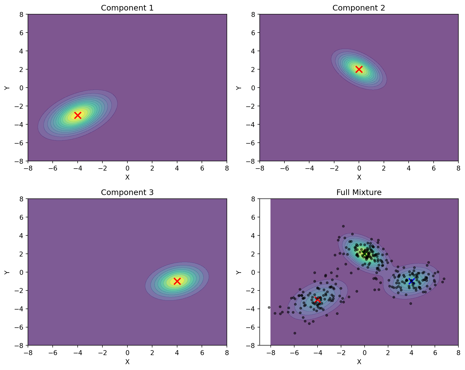
# Demonstrate a 3-component GMM in 2D
def plot_gmm_components():
    # Create grid
    x = np.linspace(-8, 8, 100)
    y = np.linspace(-8, 8, 100)
    X, Y = np.meshgrid(x, y)
    pos = np.empty(X.shape + (2,))
    pos[:, :, 0] = X
    pos[:, :, 1] = Y
    
    # Define 3 Gaussian components
    means = [
        np.array([-4, -3]),
        np.array([0, 2]),
        np.array([4, -1])
    ]
    
    covs = [
        np.array([[2, 0.8], [0.8, 1.5]]),
        np.array([[1, -0.5], [-0.5, 1]]),
        np.array([[1.5, 0.3], [0.3, 1]])
    ]
    
    weights = [0.3, 0.4, 0.3]  # Mixing weights
    
    # Create individual Gaussians
    rv1 = multivariate_normal(means[0], covs[0])
    rv2 = multivariate_normal(means[1], covs[1])
    rv3 = multivariate_normal(means[2], covs[2])
    
    # Create figure with subplots
    fig, axs = plt.subplots(2, 2, figsize=(10, 8))
    
    # Plot individual components
    component_pdfs = []
    titles = ["Component 1", "Component 2", "Component 3", "Full Mixture"]
    components = [
        rv1.pdf(pos), 
        rv2.pdf(pos), 
        rv3.pdf(pos),
        weights[0] * rv1.pdf(pos) + weights[1] * rv2.pdf(pos) + weights[2] * rv3.pdf(pos)
    ]
    
    # Random sample data from the mixture
    np.random.seed(42)
    n_samples = 300
    mixture_samples = []
    
    # Draw samples from the mixture
    for _ in range(n_samples):
        # Choose component based on weights
        component = np.random.choice(3, p=weights)
        # Draw from selected component
        if component == 0:
            sample = np.random.multivariate_normal(means[0], covs[0])
        elif component == 1:
            sample = np.random.multivariate_normal(means[1], covs[1])
        else:
            sample = np.random.multivariate_normal(means[2], covs[2])
        mixture_samples.append(sample)
    
    mixture_samples = np.array(mixture_samples)
    
    # Plot each component and the mixture
    for i, (ax, pdf, title) in enumerate(zip(axs.flat, components, titles)):
        contour = ax.contourf(X, Y, pdf, cmap='viridis', alpha=0.7, levels=12)
        ax.set_title(title)
        ax.set_xlabel('X')
        ax.set_ylabel('Y')
        
        # Add component means
        if i < 3:
            ax.scatter(means[i][0], means[i][1], 
                     color='red', s=100, marker='x', linewidth=2)
        else:
            # In the full mixture plot, show all means and the data points
            for j, mean in enumerate(means):
                ax.scatter(mean[0], mean[1], 
                        color=['r', 'g', 'b'][j], s=80, marker='x', linewidth=2)
            
            # Add the mixture data points
            ax.scatter(mixture_samples[:, 0], mixture_samples[:, 1], 
                     color='black', s=10, alpha=0.5)
    
    plt.tight_layout()
    plt.show()

plot_gmm_components()

Visualization of a three-component Gaussian Mixture Model

1.2.3 1D Model Fitting Examples

Visualizing how GMM fits data on a number line helps understand parameter selection:

Code
# 1D GMM example with number line visualization
def plot_1d_gmm_numberline():
    # Generate data from mixture of 1D Gaussians
    np.random.seed(42)
    n_samples = 50  # Fewer samples for clarity
    
    # True distribution: mixture of two Gaussians
    x1 = np.random.normal(-2, 0.8, int(0.4 * n_samples))
    x2 = np.random.normal(3, 1.2, int(0.6 * n_samples))
    x = np.concatenate([x1, x2])
    
    # Plotting range
    x_range = np.linspace(-6, 8, 1000)
    
    fig, (ax1, ax2) = plt.subplots(2, 1, figsize=(10, 6))
    
    # Poor parameter choices
    means_poor = [-1, 1]
    variances_poor = [1, 1]
    weights_poor = [0.5, 0.5]
    
    # Better parameter choices
    means_good = [-2, 3]
    variances_good = [0.7, 1.5]
    weights_good = [0.4, 0.6]
    
    # Function to plot each case
    def plot_gmm_case(ax, means, variances, weights, title):
        # Plot the data points on number line
        ax.plot(x, np.zeros_like(x), 'kx', markersize=6)
        
        # Small jitter for visibility
        ax.plot(x, np.random.normal(0, 0.02, size=len(x)), 'kx', alpha=0.3, markersize=4)
        
        # Plot distributions
        pdf_total = np.zeros_like(x_range)
        
        for i in range(2):
            # Component curve
            component = weights[i] * 1/np.sqrt(2*np.pi*variances[i]) * \
                      np.exp(-(x_range - means[i])**2 / (2*variances[i]))
            pdf_total += component
            
            # Scale components for visibility
            scaled_component = 0.4 * component / np.max(component)
            ax.plot(x_range, scaled_component, '--', linewidth=1.5, 
                   color=['blue', 'green'][i], 
                   label=f'Gaussian Component {i+1}')
            
            # Mark the mean
            ax.axvline(x=means[i], ymax=0.3, linestyle=':', 
                      color=['blue', 'green'][i])
            ax.text(means[i], 0.35, f'μ={means[i]}', 
                   color=['blue', 'green'][i], 
                   horizontalalignment='center')
        
        # Plot the full mixture (scaled)
        scaled_total = 0.8 * pdf_total / np.max(pdf_total)
        ax.plot(x_range, scaled_total, 'r-', linewidth=2.5, label='Combined Mixture')
        
        # Set title and labels
        ax.set_title(title)
        ax.set_yticks([])
        ax.spines['left'].set_visible(False)
        ax.spines['right'].set_visible(False)
        ax.spines['top'].set_visible(False)
        ax.set_ylim(-0.1, 1)
        ax.legend(loc='upper right')
    
    # Plot each case
    plot_gmm_case(ax1, means_poor, variances_poor, weights_poor, 
                 'Poor Parameter Choice')
    plot_gmm_case(ax2, means_good, variances_good, weights_good, 
                 'Better Parameter Choice')
    
    # X-axis label only on bottom plot
    ax2.set_xlabel('x')
    
    plt.tight_layout()
    plt.show()

plot_1d_gmm_numberline()

Comparing poor and good GMM parameter choices for 1D data

1.2.4 Convergence Monitoring

The EM algorithm’s convergence can be monitored through log-likelihood:

Code
# Simple log-likelihood plot example
iterations = np.arange(10)
log_likelihood = -100 + 20 * np.log(iterations + 1)  # Simulated values
plt.figure(figsize=(7, 4))
plt.plot(iterations, log_likelihood, 'o-')
plt.xlabel('Iteration')
plt.ylabel('Log-Likelihood')
plt.grid(True)
plt.title('Convergence Monitoring in EM Algorithm')
plt.show()

Example of log-likelihood convergence in EM algorithm

1.2.5 One-Hot Initialization from K-Means

K-Means results provide an effective initialization for GMM:

Code
# Simplified example of converting K-Means labels to one-hot probabilities
kmeans_labels = np.array([0, 0, 1, 1, 2, 2, 0, 1, 2])
n_samples = len(kmeans_labels)
n_clusters = 3

# Initialize with one-hot encoding
gamma = np.zeros((n_samples, n_clusters))
for i in range(n_samples):
    gamma[i, kmeans_labels[i]] = 1.0

print("Initial gamma matrix (one-hot encoding of cluster assignments):")
print(gamma[:4])  # First few rows
Initial gamma matrix (one-hot encoding of cluster assignments):
[[1. 0. 0.]
 [1. 0. 0.]
 [0. 1. 0.]
 [0. 1. 0.]]

1.2.6 Numerical Stability in Matrix Operations

Covariance matrices in EM may become ill-conditioned:

Code
# Example of regularizing a covariance matrix
cov = np.array([[0.1, 0.09], [0.09, 0.1]])  # Nearly singular matrix
print(f"Original condition number: {np.linalg.cond(cov):.1f}")

# Add small constant to diagonal
epsilon = 1e-5
cov_reg = cov + np.eye(2) * epsilon
print(f"Regularized condition number: {np.linalg.cond(cov_reg):.1f}")
Original condition number: 19.0
Regularized condition number: 19.0

2 Working with HDF5 Files

2.1 Introduction to HDF5

HDF5 (Hierarchical Data Format version 5) provides an efficient way to store and access structured data. It supports storage of multiple arrays within a single file with fast random access.

2.1.1 Basic File Operations

Understanding HDF5 file structure helps when working with stored data:

Code
def demonstrate_hdf5_basics():
    """Show basic HDF5 file operations"""
    # Create sample data
    data1 = np.random.rand(5, 10)
    data2 = np.random.randint(0, 2, size=(3, 5))  # Binary data
    
    # Write to HDF5 file
    with h5py.File('example.h5', 'w') as f:
        # Create datasets with different names
        f.create_dataset('float_array', data=data1)
        f.create_dataset('binary_array', data=data2)
        
        # Add metadata as attributes
        f['float_array'].attrs['description'] = 'Random float values'
        f['binary_array'].attrs['description'] = 'Random binary values'
    
    # Read from HDF5 file
    with h5py.File('example.h5', 'r') as f:
        # List all datasets
        print("Datasets in file:", list(f.keys()))
        
        # Access data
        float_data = f['float_array'][:]
        binary_data = f['binary_array'][:]
        
        # Read attributes
        print("Float array description:", f['float_array'].attrs['description'])
        
        # Print shapes
        print("Float array shape:", float_data.shape)
        print("Binary array shape:", binary_data.shape)

demonstrate_hdf5_basics()
Datasets in file: ['binary_array', 'float_array']
Float array description: Random float values
Float array shape: (5, 10)
Binary array shape: (3, 5)

2.1.2 Generating Random Binary Sequences

When creating binary sequences manually, patterns often emerge that wouldn’t appear in truly random data:

Code
def visualize_binary_sequences():
    """Visualize and compare binary sequences"""
    # Simulated human-generated sequence (tends to alternate more)
    human_seq = np.array([1, 0, 1, 0, 1, 1, 0, 0, 1, 0, 1, 0, 0, 1, 1, 0, 1, 0, 1, 0])
    
    # Computer-generated random sequence
    np.random.seed(42)
    computer_seq = np.random.randint(0, 2, size=20)
    
    # Visualization
    fig, (ax1, ax2) = plt.subplots(2, 1, figsize=(10, 5))
    
    # Plot human sequence
    ax1.step(range(len(human_seq)), human_seq, 'r-', where='mid', linewidth=2)
    ax1.scatter(range(len(human_seq)), human_seq, color='red', s=100)
    ax1.set_title('Human-Generated Binary Sequence')
    ax1.set_ylim(-0.1, 1.1)
    ax1.set_yticks([0, 1])
    ax1.grid(True)
    
    # Plot computer sequence
    ax2.step(range(len(computer_seq)), computer_seq, 'b-', where='mid', linewidth=2)
    ax2.scatter(range(len(computer_seq)), computer_seq, color='blue', s=100)
    ax2.set_title('Computer-Generated Binary Sequence')
    ax2.set_ylim(-0.1, 1.1)
    ax2.set_yticks([0, 1])
    ax2.set_xlabel('Position')
    ax2.grid(True)
    
    plt.tight_layout()
    plt.show()
    
    # Count transitions
    human_transitions = sum(human_seq[i] != human_seq[i+1] for i in range(len(human_seq)-1))
    computer_transitions = sum(computer_seq[i] != computer_seq[i+1] for i in range(len(computer_seq)-1))
    
    print(f"Human sequence transitions: {human_transitions}/{len(human_seq)-1}")
    print(f"Computer sequence transitions: {computer_transitions}/{len(computer_seq)-1}")

visualize_binary_sequences()

Comparing human-generated vs. computer-generated random binary sequences
Human sequence transitions: 15/19
Computer sequence transitions: 10/19

2.1.3 Validating HDF5 File Content

It’s important to verify that HDF5 files contain the expected data:

Code
def verify_hdf5_content(filename='example.h5'):
    """Demonstrate validation of HDF5 file contents"""
    try:
        with h5py.File(filename, 'r') as f:
            # Check file structure
            print("File structure:")
            def print_structure(name, obj):
                if isinstance(obj, h5py.Dataset):
                    print(f"  - Dataset: {name}, Shape: {obj.shape}, Type: {obj.dtype}")
                elif isinstance(obj, h5py.Group):
                    print(f"  - Group: {name}")
            
            f.visititems(print_structure)
            
            # Check specific dataset
            if 'binary_array' in f:
                data = f['binary_array'][:]
                
                # Validate binary values
                is_binary = np.all(np.isin(data, [0, 1]))
                print(f"Contains only binary values (0, 1): {is_binary}")
                
                # Check dimensions
                print(f"Array dimensions: {data.shape}")
            else:
                print("Binary array not found in file")
                
    except Exception as e:
        print(f"Error reading file: {e}")

verify_hdf5_content()
File structure:
  - Dataset: binary_array, Shape: (3, 5), Type: int64
  - Dataset: float_array, Shape: (5, 10), Type: float64
Contains only binary values (0, 1): True
Array dimensions: (3, 5)

2.1.4 Efficient Data Access

HDF5’s key advantage is efficient access to selected portions of data:

Code
def demonstrate_random_access():
    """Show efficient random access to HDF5 data"""
    # Create a larger dataset
    large_data = np.random.rand(1000, 50)
    
    # Write to file
    with h5py.File('large_example.h5', 'w') as f:
        f.create_dataset('large_array', data=large_data)
    
    # Access specific elements
    with h5py.File('large_example.h5', 'r') as f:
        dataset = f['large_array']
        
        # Get specific indices
        indices = [5, 120, 342, 867]
        selected_rows = dataset[indices]
        
        print(f"Shape of full dataset: {dataset.shape}")
        print(f"Shape of selected rows: {selected_rows.shape}")
        
        # Get specific region
        region = dataset[200:205, 10:15]
        print(f"Shape of region: {region.shape}")

demonstrate_random_access()
Shape of full dataset: (1000, 50)
Shape of selected rows: (4, 50)
Shape of region: (5, 5)

3 Feed-Forward Neural Networks for MNIST

3.1 MNIST Dataset Structure

The MNIST dataset contains 28×28 pixel handwritten digit images. Understanding the data organization is essential:

Code
# Create sample MNIST digit for visualization
def create_sample_digit():
    # Generate a simplified "3" digit
    digit = np.zeros((28, 28))
    
    # Top curve
    for j in range(10, 18):
        digit[5, j] = 1.0
    
    # Right side of top curve
    for i in range(5, 14):
        digit[i, 18] = 1.0
    
    # Middle line
    for j in range(10, 18):
        digit[14, j] = 1.0
    
    # Right side of bottom curve
    for i in range(14, 22):
        digit[i, 18] = 1.0
    
    # Bottom curve
    for j in range(10, 18):
        digit[22, j] = 1.0
    
    return digit

# Visualize the digit
digit = create_sample_digit()
plt.figure(figsize=(5, 5))
plt.imshow(digit, cmap='gray')
plt.axis('off')
plt.title('Sample Digit (3)')
plt.show()

# Show vector representation
flattened = digit.flatten()
print(f"Image shape: {digit.shape}, Flattened length: {len(flattened)}")

Example MNIST digit visualization
Image shape: (28, 28), Flattened length: 784

3.2 Neural Network Architecture

A Multi-Layer Perceptron (MLP) is organized as a sequence of layers, each performing a linear transformation followed by a non-linear activation:

Code
def visualize_network_architecture():
    # Create figure
    fig, ax = plt.subplots(figsize=(8, 4))
    
    # Layer sizes (simplified)
    layers = [
        {"name": "Input", "size": 784, "color": "lightskyblue", "width": 0.8, "height": 2.8},
        {"name": "Hidden 1", "size": 200, "color": "lightgreen", "width": 0.8, "height": 2.4},
        {"name": "Hidden 2", "size": 100, "color": "lightgreen", "width": 0.8, "height": 2.0},
        {"name": "Output", "size": 10, "color": "salmon", "width": 0.8, "height": 1.6}
    ]
    
    # Position layers horizontally
    spacing = 2.0
    for i, layer in enumerate(layers):
        # Draw layer box
        x = i * spacing
        y = (3 - layer["height"]) / 2  # Center vertically
        rect = plt.Rectangle((x, y), layer["width"], layer["height"], 
                            facecolor=layer["color"], edgecolor="gray", alpha=0.7)
        ax.add_patch(rect)
        
        # Add layer name and size
        ax.text(x + layer["width"]/2, y - 0.3, 
               f"{layer['name']}\n({layer['size']} neurons)", 
               ha='center', va='center', fontsize=9)
        
        # Add nodes (just a few representative ones)
        if layer["size"] <= 10:
            # Show all nodes if few
            for j in range(layer["size"]):
                node_y = y + 0.2 + j * (layer["height"] - 0.4) / max(1, layer["size"]-1)
                ax.plot(x + layer["width"]/2, node_y, 'o', markersize=6, color='white', 
                       markeredgecolor='gray')
        else:
            # Show just 3 nodes with ellipsis
            for j in range(3):
                pos = [0.1, 0.5, 0.9]  # Relative positions
                node_y = y + 0.2 + pos[j] * (layer["height"] - 0.4)
                ax.plot(x + layer["width"]/2, node_y, 'o', markersize=6, color='white', 
                       markeredgecolor='gray')
            ax.text(x + layer["width"]/2, y + layer["height"]/2, "...", fontsize=14)
        
        # Draw connections to next layer
        if i < len(layers) - 1:
            # Connection label (activation function)
            label = "ReLU" if i < len(layers) - 2 else "Softmax"
            ax.text(x + spacing/2 + layer["width"]/2, 3.3, label, ha='center', fontsize=9)
            
            # Connection arrows
            next_x = (i+1) * spacing
            for src_y in [y + 0.3, y + layer["height"]/2, y + layer["height"] - 0.3]:
                for dst_y in [layers[i+1]["height"]/2 + (3 - layers[i+1]["height"])/2]:
                    ax.arrow(x + layer["width"], src_y, 
                            next_x - (x + layer["width"]), dst_y - src_y,
                            head_width=0.05, head_length=0.1, fc='gray', ec='gray', alpha=0.3)
    
    ax.set_xlim(-0.5, (len(layers)-1) * spacing + 1.5)
    ax.set_ylim(-0.8, 3.8)
    ax.set_axis_off()
    ax.set_title("Multi-Layer Perceptron for MNIST", fontsize=12)
    
    plt.tight_layout()
    plt.show()

visualize_network_architecture()

MLP architecture for MNIST classification

3.3 ReLU Activation Function

The Rectified Linear Unit (ReLU) introduces non-linearity by setting negative values to zero:

Code
def plot_relu():
    x = np.linspace(-3, 3, 100)
    y = np.maximum(0, x)
    
    plt.figure(figsize=(6, 4))
    plt.plot(x, y, 'b-', linewidth=2)
    plt.plot(x, x, 'r--', alpha=0.5)
    plt.grid(True, alpha=0.3)
    plt.axhline(y=0, color='k', linestyle='-', alpha=0.3)
    plt.axvline(x=0, color='k', linestyle='-', alpha=0.3)
    plt.xlabel('Input (x)')
    plt.ylabel('Output (ReLU(x))')
    plt.title('ReLU Activation Function')
    plt.legend(['ReLU(x) = max(0, x)', 'Linear'])
    plt.show()
    
    # Simple implementation
    print("ReLU Implementation:")
    print("def relu(x):")
    print("    return np.maximum(0, x)")

plot_relu()

ReLU activation function
ReLU Implementation:
def relu(x):
    return np.maximum(0, x)

3.4 Softmax Function for Classification

Softmax converts raw network outputs into class probabilities that sum to 1:

Code
def plot_softmax():
    # Example raw outputs from network
    logits = np.array([2.0, 5.0, 1.0, 0.5, 3.0])
    
    # Naive (potentially unstable) implementation
    def naive_softmax(x):
        return np.exp(x) / np.sum(np.exp(x))
    
    # Numerically stable implementation
    def stable_softmax(x):
        shifted_x = x - np.max(x)
        exp_x = np.exp(shifted_x)
        return exp_x / np.sum(exp_x)
    
    # Apply softmax
    probs = stable_softmax(logits)
    
    # Create visualization
    plt.figure(figsize=(8, 4))
    
    # Plot raw values
    plt.subplot(1, 2, 1)
    plt.bar(np.arange(len(logits)), logits, color='blue', alpha=0.7)
    plt.title('Raw Network Outputs')
    plt.xlabel('Class')
    plt.ylabel('Value')
    plt.xticks(np.arange(len(logits)))
    
    # Plot probabilities
    plt.subplot(1, 2, 2)
    plt.bar(np.arange(len(probs)), probs, color='red', alpha=0.7)
    plt.title('Softmax Probabilities')
    plt.xlabel('Class')
    plt.ylabel('Probability')
    plt.xticks(np.arange(len(probs)))
    plt.ylim(0, 1)
    
    plt.tight_layout()
    plt.show()
    
    # Show implementation
    print("Softmax Implementation (Numerically Stable):")
    print("def softmax(x):")
    print("    shifted_x = x - np.max(x)")
    print("    exp_x = np.exp(shifted_x)")
    print("    return exp_x / np.sum(exp_x)")
    
    print("\nInput values:", logits)
    print("Softmax output:", probs)
    print("Sum of probabilities:", np.sum(probs))

plot_softmax()

Softmax transformation
Softmax Implementation (Numerically Stable):
def softmax(x):
    shifted_x = x - np.max(x)
    exp_x = np.exp(shifted_x)
    return exp_x / np.sum(exp_x)

Input values: [2.  5.  1.  0.5 3. ]
Softmax output: [0.04099229 0.82335225 0.01508022 0.00914662 0.11142861]
Sum of probabilities: 1.0

3.5 Forward Propagation Through Layers

The feed-forward process passes data through successive transformations:

Code
# Create simplified network components
np.random.seed(42)

# Small example (3 inputs → 2 hidden → 2 outputs)
x = np.array([[0.5], [0.1], [0.9]])         # Input
W1 = np.array([[0.1, 0.2, -0.1], 
               [-0.1, 0.1, 0.3]])           # First layer weights
b1 = np.array([[0.1], [0.2]])               # First layer bias

# First layer computation
z1 = W1 @ x + b1                            # Linear transformation
a1 = np.maximum(0, z1)                      # ReLU activation

W2 = np.array([[0.2, 0.3], [0.1, -0.2]])    # Second layer weights
b2 = np.array([[0.1], [0.2]])               # Second layer bias

# Output layer computation
z2 = W2 @ a1 + b2                           # Linear transformation
e_z2 = np.exp(z2 - np.max(z2))              # Stabilized exponential
a2 = e_z2 / np.sum(e_z2)                    # Softmax normalization

# Visualization
plt.figure(figsize=(8, 4))

# Layer positions
layer_x = [1, 4, 7]
node_y = [[1, 2, 3], [1.5, 2.5], [1.5, 2.5]]
labels = ['Input', 'Hidden\n(ReLU)', 'Output\n(Softmax)']
colors = ['skyblue', 'lightgreen', 'salmon']
values = [x.flatten(), a1.flatten(), a2.flatten()]

# Draw each layer
for i, (x_pos, y_pos, label, color, vals) in enumerate(
    zip(layer_x, node_y, labels, colors, values)):
    
    # Layer label
    plt.text(x_pos, 0.2, label, ha='center')
    
    # Draw nodes with values
    for j, (y, val) in enumerate(zip(y_pos, vals)):
        circle = plt.Circle((x_pos, y), 0.4, color=color, alpha=0.7)
        plt.gca().add_patch(circle)
        plt.text(x_pos, y, f"{val:.2f}", ha='center', va='center')

# Connections between layers
for i in range(len(layer_x)-1):
    for y1 in node_y[i]:
        for y2 in node_y[i+1]:
            plt.plot([layer_x[i], layer_x[i+1]], [y1, y2], 'k-', alpha=0.1)

# Transformation labels
plt.text((layer_x[0] + layer_x[1])/2, 3.5, "W1, b1", ha='center')
plt.text((layer_x[1] + layer_x[2])/2, 3.5, "W2, b2", ha='center')

plt.xlim(0, 8)
plt.ylim(0, 4)
plt.axis('off')
plt.tight_layout()
plt.show()

Simple forward propagation example

3.6 Batch Processing and Output Formatting

When processing multiple images at once, efficient matrix operations can be used:

Code
def demonstrate_batch_processing():
    # Create simplified batch of 5 images with 4 pixels each
    batch_size = 5
    image_size = 4
    
    # Random batch of images
    np.random.seed(0)
    images = np.random.rand(batch_size, image_size)
    
    # Simple model weights (4 inputs, 3 outputs)
    W = np.random.randn(3, 4) * 0.1
    b = np.zeros((3, 1))
    
    print("Batch of images shape:", images.shape)
    print("Weights shape:", W.shape)
    print("Bias shape:", b.shape)
    
    # Process one by one
    results_individual = []
    for i in range(batch_size):
        # Get single image and reshape to column vector
        img = images[i].reshape(-1, 1)
        
        # Forward pass
        z = W @ img + b
        # Simplified output (no activation for demo)
        results_individual.append(z.flatten())
    
    # Process as batch
    # Transpose images to have shape (4, 5)
    images_t = images.T
    # Compute W @ images_t to get shape (3, 5)
    z_batch = W @ images_t + b
    # Each column is the result for one image
    results_batch = z_batch.T
    
    print("\nResults match:", np.allclose(results_individual, results_batch))
    
    # Demonstrate JSON formatting for output
    sample_output = {
        "index": 42,
        "activations": [0.1, 0.7, 0.05, 0.02, 0.03, 0.05, 0.02, 0.01, 0.01, 0.01],
        "classification": 1  # Index of maximum activation
    }
    
    print("\nSample JSON output format:")
    import json
    print(json.dumps(sample_output, indent=2))

demonstrate_batch_processing()
Batch of images shape: (5, 4)
Weights shape: (3, 4)
Bias shape: (3, 1)

Results match: True

Sample JSON output format:
{
  "index": 42,
  "activations": [
    0.1,
    0.7,
    0.05,
    0.02,
    0.03,
    0.05,
    0.02,
    0.01,
    0.01,
    0.01
  ],
  "classification": 1
}

3.7 Visualizing MNIST Digits

Examination of correctly and incorrectly classified digits gives insights into model performance:

Code
def visualize_classification_examples():
    # Create a few synthetic MNIST-like digits
    def create_digit(digit_type):
        img = np.zeros((28, 28))
        
        if digit_type == 0:    # Zero
            for i in range(8, 20):
                for j in range(8, 20):
                    if ((i-14)**2 + (j-14)**2 <= 36) and ((i-14)**2 + (j-14)**2 >= 16):
                        img[i, j] = 1.0
        
        elif digit_type == 1:  # One
            for i in range(7, 21):
                img[i, 14] = 1.0
        
        elif digit_type == 3:  # Three
            # Top horizontal line
            for j in range(10, 18):
                img[7, j] = 1.0
            # Middle horizontal line
            for j in range(10, 18):
                img[14, j] = 1.0
            # Bottom horizontal line
            for j in range(10, 18):
                img[21, j] = 1.0
            # Right vertical lines
            for i in range(7, 14):
                img[i, 18] = 1.0
            for i in range(14, 21):
                img[i, 18] = 1.0
                
        return img
    
    # Create example digits
    digits = [create_digit(0), create_digit(1), create_digit(3)]
    
    # Random network outputs (predicted probabilities)
    predictions = [
        [0.9, 0.02, 0.01, 0.01, 0.01, 0.01, 0.01, 0.01, 0.01, 0.01],  # Correct: 0
        [0.05, 0.8, 0.02, 0.01, 0.01, 0.05, 0.02, 0.02, 0.01, 0.01],  # Correct: 1
        [0.01, 0.01, 0.01, 0.7, 0.01, 0.01, 0.01, 0.20, 0.03, 0.01]   # Correct: 3
    ]
    
    # Create visualization with fixed layout
    fig = plt.figure(figsize=(12, 6))
    
    for i, (digit, pred) in enumerate(zip(digits, predictions)):
        # Main digit display
        ax1 = fig.add_subplot(2, 3, i+1)
        ax1.imshow(digit, cmap='gray')
        ax1.set_title(f"Digit example: {np.argmax(pred)}")
        ax1.axis('off')
        
        # Prediction bars in separate row below
        ax2 = fig.add_subplot(2, 3, i+4)
        ax2.bar(range(10), pred)
        ax2.set_xticks(range(10))
        ax2.set_ylim(0, 1)
        ax2.set_title("Predictions")
    
    plt.tight_layout()
    plt.show()

visualize_classification_examples()

Visualizing MNIST digit classification

3.8 Classification Output Processing

After forward propagation, converting outputs to a final classification involves:

Code
# Example of processing network outputs
raw_output = np.array([0.3, 1.2, -0.5, 2.1, 0.8, -0.4, 0.2, 0.5, 0.1, -0.2])

# Apply softmax
def softmax(x):
    exp_x = np.exp(x - np.max(x))
    return exp_x / np.sum(exp_x)

probabilities = softmax(raw_output)
predicted_class = np.argmax(probabilities)

# Visualization
plt.figure(figsize=(7, 4))
plt.bar(range(10), probabilities)
plt.axvline(x=predicted_class, color='red', linestyle='--')
plt.text(predicted_class, 0.01, f"Prediction: {predicted_class}", color='red',
         ha='center', bbox=dict(facecolor='white', alpha=0.8))
plt.xlabel('Digit Class')
plt.ylabel('Probability')
plt.title('Network Output Probabilities')
plt.xticks(range(10))
plt.ylim(0, 1)
plt.grid(True, alpha=0.3)
plt.show()

# Output statistics
print(f"Predicted class: {predicted_class}")
print(f"Confidence: {probabilities[predicted_class]:.4f}")

Softmax outputs and class prediction
Predicted class: 3
Confidence: 0.3864